Counter-Terrorist Soldier Patrolling Inferno Village Street coloring page
Counter-Terrorist soldier Guarding Inferno village street Colouring Page, perfect game players, colouring games and Tactical Art.
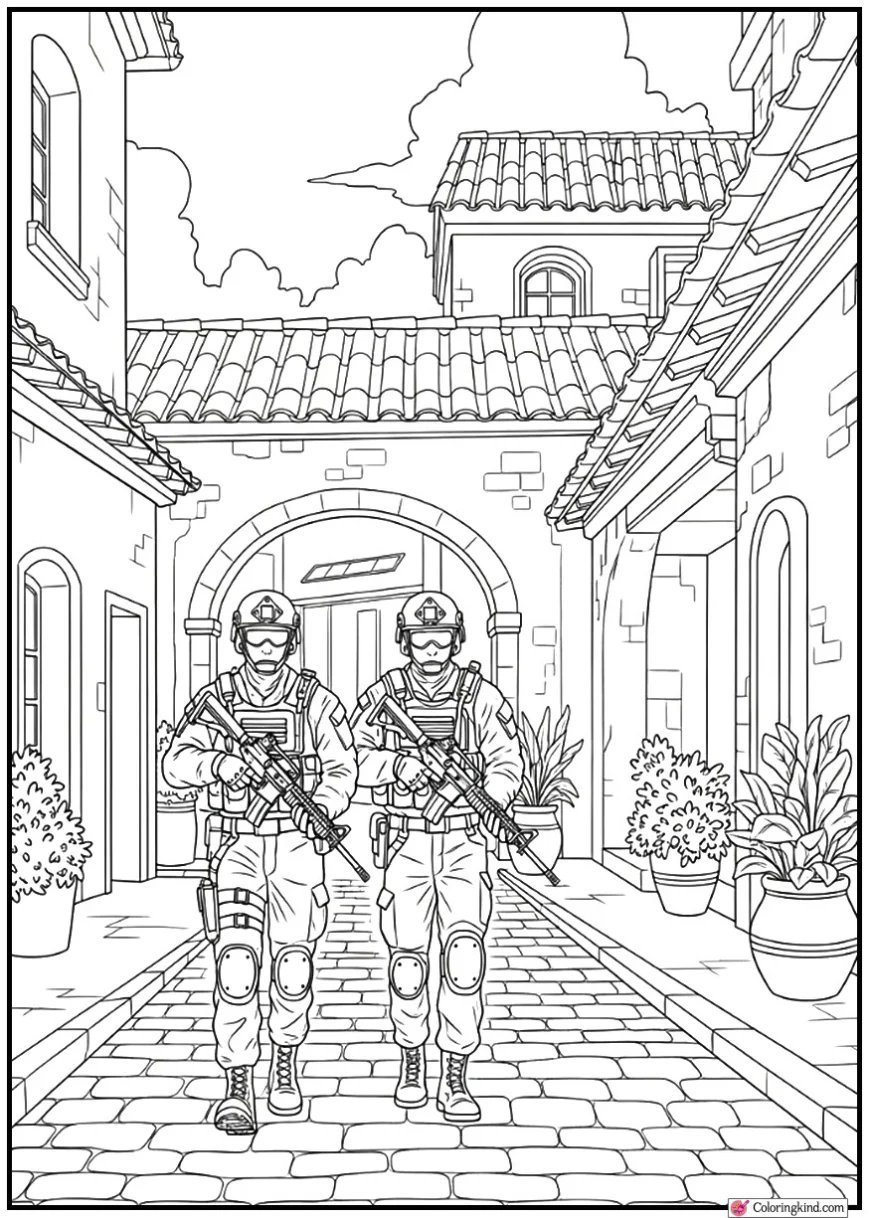


This colour page depicts a Counter-Terrorist soldier in the village street Inferno based on the tactical battle theme and feel of Counter-Strike. The scene shows a serene and yet vigilant patrol scene, where awareness, location and map control play a main role. The village streets of inferno are characterised by narrow lanes, Mediterranean style architecture and close proximity, which are depicted using the most basic environmental components. The posture of the soldier implies discipline and preparedness, insisting on the defensive play and occupying the territories instead of fighting. This colouring page is age-appropriate due to clear lines and the fine amount of detail, hence discrepant to teenagers, adults, and older children, who like military art and immersive colouring activities. Being a printable screen-free activity, it promotes creativity, attention, and the development of fine motor abilities and helps fans to redesign a recognisable Counter-Strike space using artistic expression.
How To Color This Page
The Counter-Terrorist soldier that is patrolling the Inferno village street should be coloured in warm, European based colour palette which is reminiscent of the map set-out which takes place outside. Begin with light pencil marks in order to create base colours, then some flexibility is granted to add shading afterwards. The uniform of the soldier suits well in the navy blue, dark grey, dull green, or charcoal shades, which does reflect a professional tactical look. Darker colouring on lines of fabric, edges of armour and harnessing straps to add depth and form and look more real.
In the case of the Inferno village setting the colour palette of warm earth colours beige, soft brown, light terracotta and dull yellow should be used to depict the stone walls, plaster constructions and paved avenues. Shutters and roof tiles can be slightly darkened in order to create contrast and visual value. Low gradients on the walls and surfaces on the streets can be used to create the effect of perspective and distance, particularly on small village lanes.
The color of weapons and equipment must be dark gray or matte black of metal parts with a slight highlighting in their edges to localize reflected light. Glove, boots, accessories are allowed to be slightly darker to bring the character down to the ground. Coloured pencils are perfect in giving good control, particularly around the hands, features of the face, and architectural details. Marks can be applied sparingly to larger background areas when the paper permits it (varying according to paper quality) however, pencils give better effects to textures.
Another important aspect of lighting direction is to have shadows below the soldier feet, at the corners of the buildings, and behind objects as it will look more real and dimensional. Colorists can then use weathering effects, e.g. worn stone, faded paint, or light dust, but younger artists can use brighter colour combinations, or more stylized ones. The main intention is to have fun in the process of colouring with the aim of creating this calm but tense atmosphere of an Inferno patrol with own imagination and version.